SICILIA CREATIVE
Risk App Redesign
Risk App Redesign
For this project, students were instructed to conduct user testing on a small group of people in order to discover pain points within the Risk app. After this problem discovery phase, we were instructed to create a low fidelity prototype of a redesigned version of the app that solved our user's problems. Once complete, we would then return to user testing, collecting feedback about our prototype to refine and finalize our designs.

Research
Research
After interviewing five different users about their experience using the Risk app, multiple pain points were addressed as problems that would need to be solved in my redesign. Here are a few of the problem areas that users brought to light:
Game controls have a left-handed bias, something even a left-handed user noted was unusual since so many games are built with controls on the right
Certain buttons such as the settings, help, battle log, and "Next Phase" buttons are too small and hard to click
Certain icons like the view mode toggle and battle log do not clearly communicate what the button represents
User interface overall is fairly small, although it does keep the interface uncluttered
Pop ups like settings and help are awkward and disruptive to gameplay
Research
After interviewing five different users about their experience using the Risk app, multiple pain points were addressed as problems that would need to be solved in my redesign. Here are a few of the problem areas that users brought to light:
Game controls have a left-handed bias, something even a left-handed user noted was unusual since so many games are built with controls on the right
Certain buttons such as the settings, help, battle log, and "Next Phase" buttons are too small and hard to click
Certain icons like the view mode toggle and battle log do not clearly communicate what the button represents
User interface overall is fairly small, although it does keep the interface uncluttered
Pop ups like settings and help are awkward and disruptive to gameplay

Design
Design
With the discoveries from my initial user testing in mind, I set out to design a new interface that would solve users' pain points, while maintaining the game's minimal and uncluttered design. My goals for this redesign were:
Orient the most frequently used game features to the right side of the screen for more intuitive controls
Enlarge buttons and controls without cluttering the main gameplay area
Create new icons that clearly communicate the feature they represent
Make pop ups like settings and help menus less disruptive and awkward
Design
With the discoveries from my initial user testing in mind, I set out to design a new interface that would solve users' pain points, while maintaining the game's minimal and uncluttered design. My goals for this redesign were:
Orient the most frequently used game features to the right side of the screen for more intuitive controls
Enlarge buttons and controls without cluttering the main gameplay area
Create new icons that clearly communicate the feature they represent
Make pop ups like settings and help menus less disruptive and awkward

User Testing
User Testing
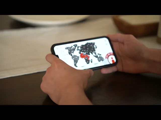
My prototype was then tested amongst five different users with edits made throughout based on user notes and suggestions. The video below showcases this process:
My prototype was then tested amongst five different users with edits made throughout based on user notes and suggestions. The video below showcases this process:
User Testing
My prototype was then tested amongst five different users with edits made throughout based on user notes and suggestions. The video below showcases this process:
More Works More Works
More Works More Works

